


 Powered by Comercia.io
Color realism tattooing is built on value contrast, warm and cool color relationships, deliberate ink layering, and needle selection by design area. For broad color transitions, compare curved magnums; use magnums for larger filled regions and liners for fine details. StarBrite emphasizes planning the tonal structure before selecting a palette, while Peak and Kwadron explain how cartridge configuration and machine setup support realistic color tattoo technique.
Shop Tattoo Color Sets Browse Kwadron Cartridges
QUICK ANSWER
How do you tattoo color realism with the right needles, ink and layering?
Build a value map from the reference, assign warm and cool colors to the forms, and choose needle groupings for each zone: magnums for broad color, curved mags for blends and liners for small details. Use the manufacturer-guided palette and layer plan, test transitions before the client session, and preserve contrast instead of forcing saturation through repeat passes.
Color & Values
Plan highlights, midtones, deep shadows, temperature changes and the client's skin as part of the final palette.
Needle Selection
Compare straight magnums for large fills, curved mags for broad blending and liners for edges or texture.
Layers & Healing
Allow the value structure to guide the order, avoid muddy complementary overlaps and discuss healed color without promises.
THE REALISM WORKFLOW
What is color realism tattooing, and how is it different from black and grey realism?
Color realism uses a full palette to reproduce the reference's value, hue and temperature relationships. Black and grey uses black and gray values; color realism adds warm lights, cool shadows and color blending. StarBrite emphasizes that value contrast creates dimensional form, so additional colors cannot rescue a weak tonal plan.
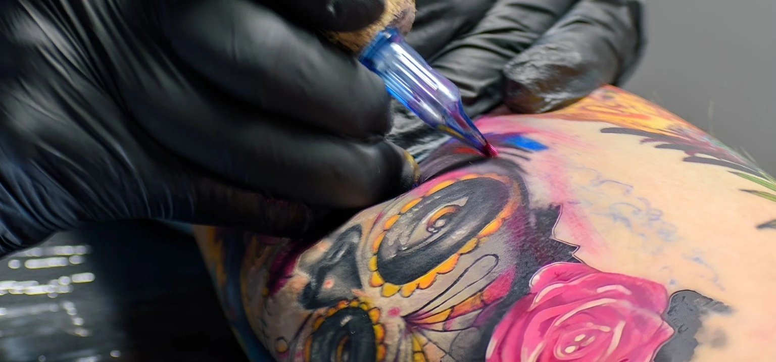
Start with the reference's major dark, middle and light shapes, then assign specific hues to those roles.
DESIGN ZONE TO TOOL
Which tattoo needle, ink and technique should you choose for highlights, warm midtones, cool shadows and contrast?
Choose needles by design zone. Kwadron names magnums for fills, curved mags for fades and liners for contours; StarBrite describes distinct highlight, midtone and shadow roles.
| Design zone | Needle to compare | Ink role | Technique and visual check |
|---|---|---|---|
| Highlights | Fine liner for a selected accent; other grouping only if the area warrants it | Reserved open-skin highlight or white ink | Mark the brightest points in the design and use restraint with white, as StarBrite advises |
| Warm midtones | Curved magnum for transitions; magnum for a broader filled region | Warm flesh or subject color selected for the reference | Maintain the planned value while shifting the hue toward the warm lit area |
| Cool shadows | Curved / soft-edge magnum; round shader in a tight region | Cooler neutral, purple, gray or blue-brown where appropriate | Build depth through value and temperature rather than only darkening the base color |
| Transition between colors | Curved magnum | Adjacent or analogous colors; manufacturer-directed mixture if needed | Use StarBrite's gradual overlapping passes, protecting the distinct colors from overworking |
| Black or dark-color contrast | Magnum for a larger area; liner for selected edges | Black or chosen deep color | Establish a readable dark anchor that supports the focal shape without flattening nearby midtones |
These are tool and color roles, not fixed pin-count rules. Test the actual cartridge and palette.
VALUE, HUE, SATURATION & TEMPERATURE
How do value contrast, warm and cool colors, and complementary hues create realism?
StarBrite says value contrast creates depth: dark darks and light lights help the eye read volume. It describes warm colors as advancing and cool colors as receding. Its rose example uses warm reds and oranges in lit areas with cooler magentas and purples in shadow; treat this as a planning example, not a universal color recipe.
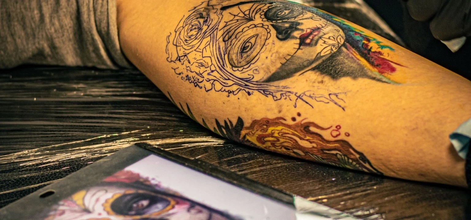
StarBrite describes analogous hues as useful for gradients, while complementary colors can neutralize into muddy browns if overworked together in the skin. Decide where neighboring pigments should blend and where they should retain a clear boundary. A deliberate complementary contrast is not the same as accidentally mixing two opposing colors.
Value before the color wheel
A richly saturated palette with weak dark-to-light separation may still look flat. Compare the drawing in terms of light, middle and dark roles before refining warm/cool relationships.
BUILDING A PROFESSIONAL PALETTE
What tattoo ink colors and sets do you need for color realism?
StarBrite recommends a broad, carefully chosen palette for color realism: subject hues, skin tones, environmental colors and neutral shadows. Select the actual roles the reference requires rather than buying every available color.
We carry Dynamic Master Collection, Dynamic OG Color Set and Eternal Ink Sample Set as palette options. Test the relevant shades and add flesh tones or white as needed. For separate product comparisons, see Bright Tattoo Ink Colors and Tattoo Ink Brands Compared.
FLESH TONES & CLIENT SKIN
How do you choose realistic skin-tone inks and account for the skin being tattooed?
StarBrite describes approximately five to seven portrait color roles: highlight, base midtone, warm midtone, cool midtone and shadows. It says shadows often shift toward cooler purples, grays or blue-browns rather than simply using a darker flesh color. These are maker examples, not a fixed number of bottles.
StarBrite says the client's skin and melanin affect color visibility. Evaluate the actual skin rather than copying a palette developed for another complexion. For the full selection discussion see Skin-Tone Tattoo Ink.
MAGNUMS, CURVED MAGS & LINERS
What tattoo needles work for color realism packing, blending and fine detail?
Kwadron describes straight magnums for large fills, soft-edge mags for subtle fades, round shaders for smaller shaded areas and liners for contours. Use those roles to plan packing, transitions and detail separately.
We carry the Kwadron, Bishop Da Vinci V2 and Nexus options below. Kwadron also describes textured needles, marked T, as helping distribute more ink into the skin.
DIAMETER, COUNT & TAPER
What pin diameter, grouping size and taper should artists check for color realism?
Peak describes #12 pins at 0.35 mm, #10 bugpins at 0.30 mm and #8 at 0.25 mm. It discusses bugpins for gradual saturation and delicate lashes, hair and skin texture. The smaller diameter is a tool option, not a universal rule.
Check count, diameter, configuration and taper on the exact label. Read How to Choose Tattoo Cartridges for the broader specifications.
GRADIENTS WITHOUT MUD
How do you blend tattoo colors smoothly without making them muddy?
StarBrite describes curved-mag blending with gradual, overlapping passes at moderate voltage, including circular or X-motion in transition zones. Test those manufacturer techniques with the actual grouping rather than forcing full saturation immediately.
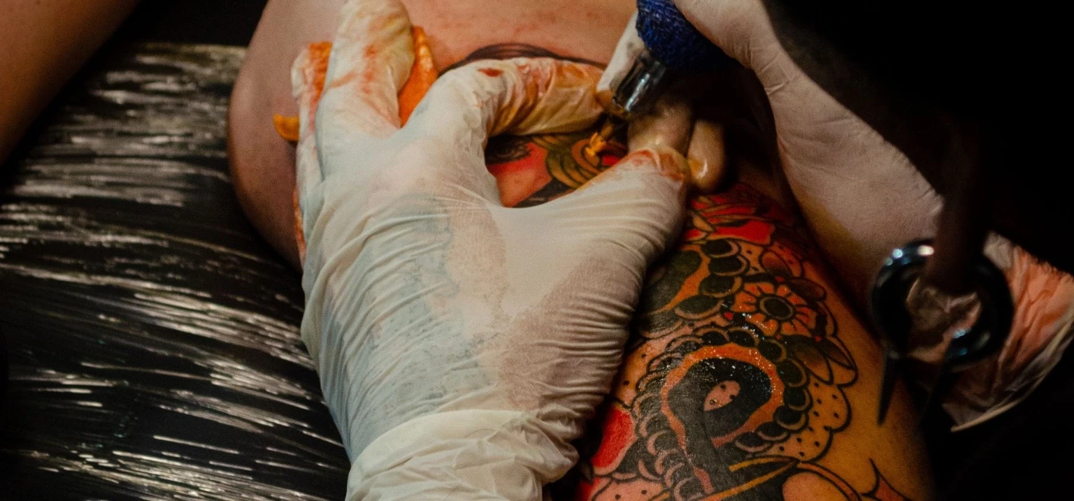
StarBrite warns that overworked complements can neutralize into muddy browns. Decide whether the design calls for a smooth analogous transition or a clear contrasting edge. Protect intentional boundaries and stop treating additional passes as the solution to every color mismatch.
For the separate mechanics of color packing, see How to Pack Color in a Tattoo. For shading motions, see Whip Shading vs Pepper Shading vs Stippling.
COLOR LAYER ORDER & OPACITY
Should you tattoo color realism dark to light, and how do layered colors interact?
StarBrite generally advises dark values and saturated regions before lighter highlights. It says underlying and overlying colors interact optically, while higher-opacity inks can partially obscure a previous color. Plan the order for the exact image and palette.
StarBrite also advises allowing a layer to settle before another and warns against overworking. Test the intended sequence on practice skin; preserve the original value map instead of repeatedly forcing color into one region.
Watch the layered color field
If the intended warm and cool colors are losing distinction, review the layer plan and skin response rather than forcing more saturation. See the separate guide on overworked skin for the broader warning signs.
CUSTOM COLORS & REPEATABILITY
How should artists mix, test and document custom colors for realistic tattoos?
StarBrite recommends beginning with a lighter or less pigmented color, adding stronger color in small increments and testing on a white surface or glove. This is maker guidance, not a dilution ratio for every brand.
Record the intended value role and follow each label. For dilution and mixing details see How to Mix and Dilute Tattoo Ink.
MACHINE SETTINGS BY TASK
What machine stroke and voltage should you use for color realism blending versus packing?
Peak describes 1.8–2.5 mm strokes for soft shading, 3.0–3.5 mm for general color blending and 4.0 mm or longer for heavy packing; it also says shading usually uses lower voltage. These are general machine-task examples, not color-realism presets.
| Peak task category | Stroke example | What an artist should evaluate |
|---|---|---|
| Soft shading | 1.8–2.5 mm | Light transitional areas and skin response with the chosen grouping |
| General color blending | 3.0–3.5 mm | Neighboring hues and gradual passages in a color realism study |
| Heavy color packing | 4.0 mm or longer | Broad, more saturated regions requiring a packing task |
StarBrite also describes moderate voltage and overlapping curved-mag passes for gradual color buildup. See Tattoo Machine Stroke, Needle Depth and Voltage for the separate settings fundamentals.
LIGHT POINTS & WHITE INK
How do you use white ink and whitewash without losing contrast in color realism?
Reserve highlights in the drawing. StarBrite warns that excessive white may overwhelm the design or fade during healing, and white over fresh black may create muddy tones or uneven healing. Do not treat white as an automatic fix for lost contrast.
We carry Allegory White Ink and the Empire Inks Whitewash Set as different options. Choose by label and intended use; see Best White Tattoo Ink.
HEALED COLOR & SUN CARE
How do color realism tattoos heal and age, and do they fade faster than black and grey?
StarBrite says bright fresh color can look softer or more muted after healing and recommends planning adequate value contrast. That is a maker observation, not a prediction for an individual tattoo or a claim that color realism fades faster than black and grey.
AAD says UV can fade some tattoo inks. For ongoing care, it recommends broad-spectrum, water-resistant SPF 30+ sunscreen, reapplied at least every two hours; it also cautions about tanning beds and petroleum jelly. Share Tattoo Aftercare Day by Day for client care and refer concerning skin reactions to a dermatologist.
AAD notes allergic tattoo reactions can develop later. See Tattoo Ink Allergy and Red Ink for that separate topic.
STEP-BY-STEP ARTIST WORKFLOW
How do you practice color realism tattoo technique step by step?
Practice the same reference fragment to compare values, temperature, cartridges and layering. This sequence translates StarBrite, Kwadron and Peak guidance into a studio preparation routine.
Map the values first
Identify the main shadows, midtones and highlights. StarBrite places value contrast at the center of realism.
Assign warm and cool roles
Assign warm light, cooler shadow, neutral transition and deliberate complementary roles.
Choose the ink palette
Match the chosen set with the reference; add flesh tones, neutrals or white for defined roles.
Assign a needle to each area
Compare magnums for fill, curved mags for blending and liners for detail; verify their specifications.
Test mixes and adjacent colors
Check maker-directed mixtures on a white surface, then test adjacent colors in practice.
Practice the layer sequence
Try the intended color order with the same cartridge and machine, avoiding overworked overlaps.
Review contrast and record the setup
Check readability of the form and record grouping, inks and machine choices.
COMMON COLOR REALISM ERRORS
What mistakes cause muddy colors, flat values or overworked color realism tattoos?
Most avoidable problems come from weak values, uncontrolled complementary overlaps or forcing saturation through repeat passes. Review these practical mistakes against StarBrite's manufacturer guidance.
Choosing hue before value
StarBrite says contrast builds depth. Map the darks and lights before choosing bright colors.
Mixing complementary pigments through overworking
StarBrite warns opposing pigments may neutralize when repeatedly worked together.
Using one grouping for both blending and heavy packing
Kwadron distinguishes wide-fill magnums from curved mags designed for transitions.
Ignoring the skin under the ink
StarBrite says client skin and melanin affect how colors are visible.
Forcing saturation with repeated passes
StarBrite advises gradual buildup and warns against excess layering.
Using white to rescue every lost highlight
StarBrite recommends restraint with white, especially over fresh black.
Assuming one machine setting suits the style
Peak describes stroke categories by task rather than one realism preset.
Promising that fresh color will heal unchanged
StarBrite says color may heal softer; AAD says UV can fade ink.
For the separate warning signs and technique issues, see Overworked Tattoo Signs and Prevention.
SVT SHOP COLOR REALISM SUPPLIES
Which magnums, color sets, skin-tone inks and white inks can artists shop at SVT Shop?
These thirteen SVT Shop listings cover liners, magnums, color sets, flesh tones and white options. Choose exact variants and read their manufacturer instructions.
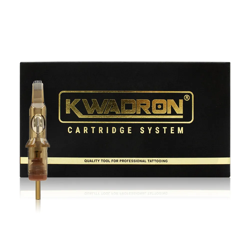 Soft Color TransitionsKwadron - Cartridges Curved MagsSoft-edge curved mags that Kwadron describes for subtle tonal changes and fades.
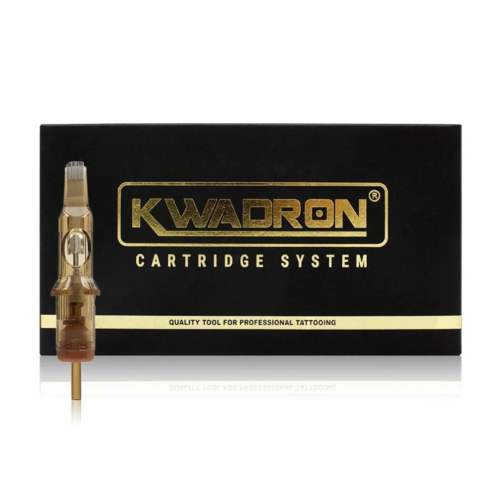 Broad Color PackingKwadron - Cartridges MagnumsStraight-magnum option for larger filled regions; verify the chosen grouping.
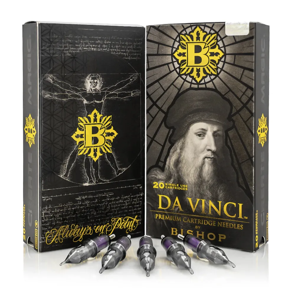 Alternative Magnum GroupingBishop - Da Vinci V2 MagnumsMagnum cartridges to compare for broad packing tasks in the design.
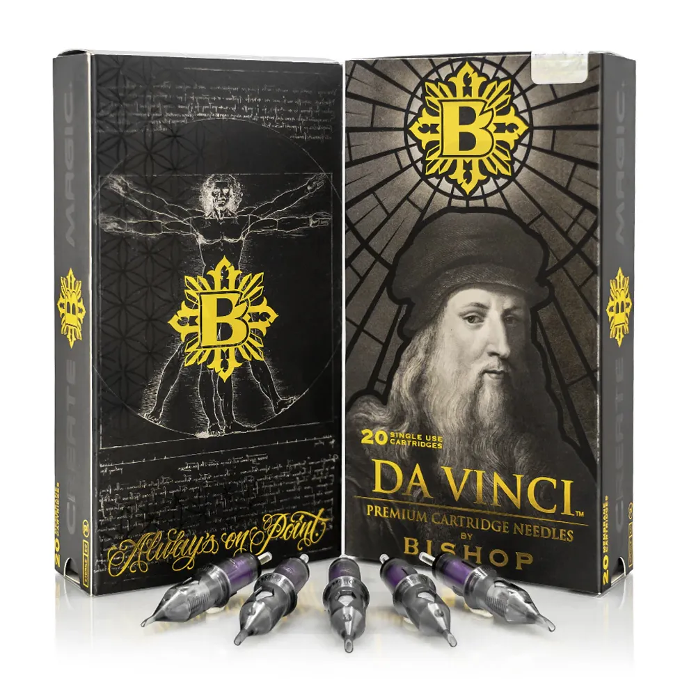 Curved-Mag BlendingBishop - Da Vinci V2 Curved MagsCurved-mag alternative for adjacent color transitions and softer blends.
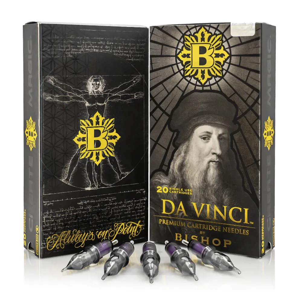 Small Features & EdgesBishop - Da Vinci V2 LinersLiner option for contours and fine realistic details in the composition.
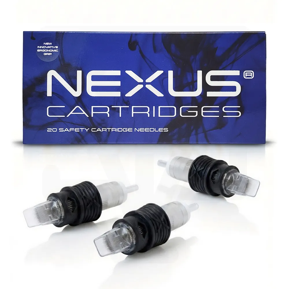 Additional Curved-Mag ChoiceNexus Cartridges - Curved MagsCurved mags to compare during broad gradient and blending practice.
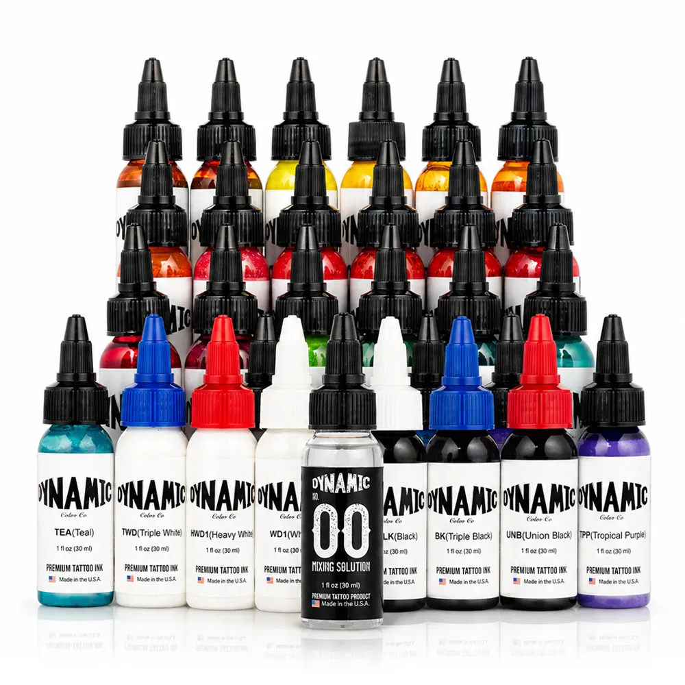 Broad Color PaletteDynamic - Master Collection Set 1 ozBroader color set option to assess against the required realism palette.
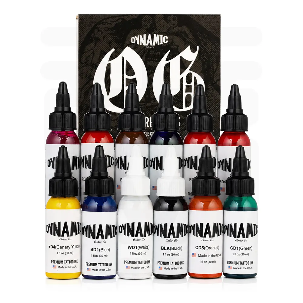 Color Set ComparisonDynamic - OG Color Set 1 ozAnother set of tattoo colors for a planned full-color workflow.
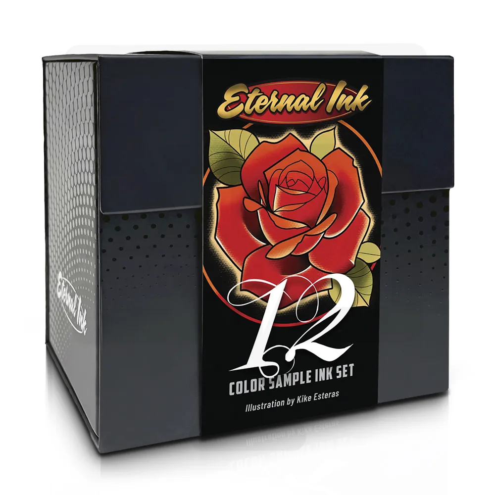 Palette SamplingEternal Ink - Sample SetSample assortment for comparing shades and the planned color range.
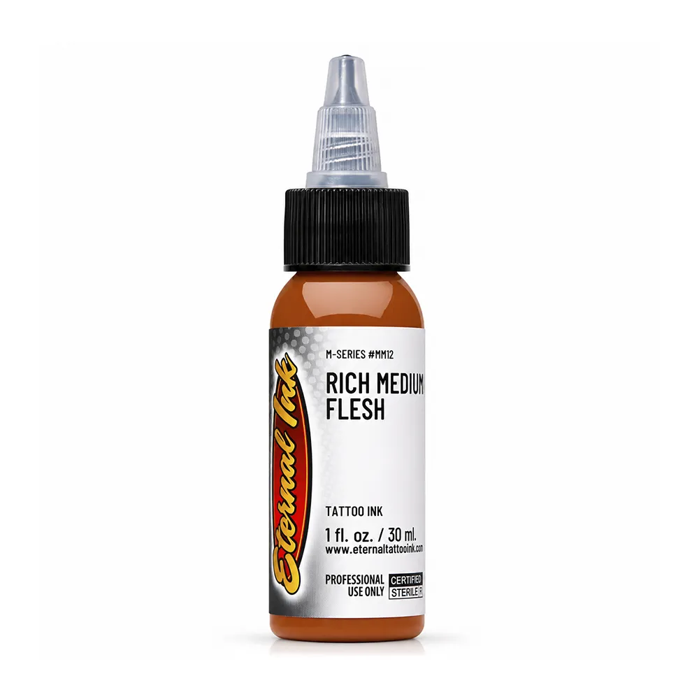 Flesh-Tone PaletteEternal Ink - Rich Medium FleshSingle skin-tone ink to compare within warm, cool and neutral midtone planning.
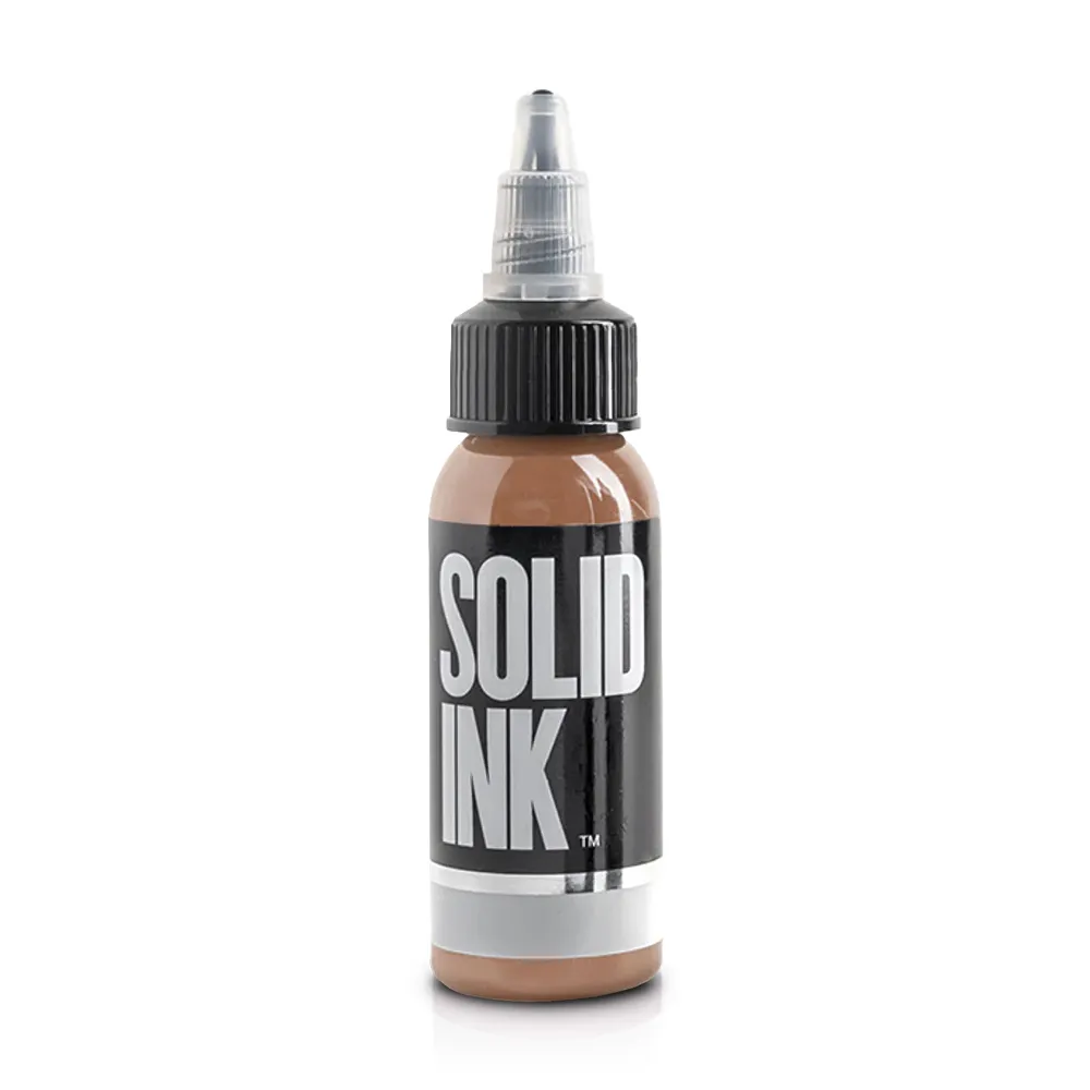 Additional Skin-Tone InkSolid Ink - FleshFlesh-color option for building a reference-specific color palette.
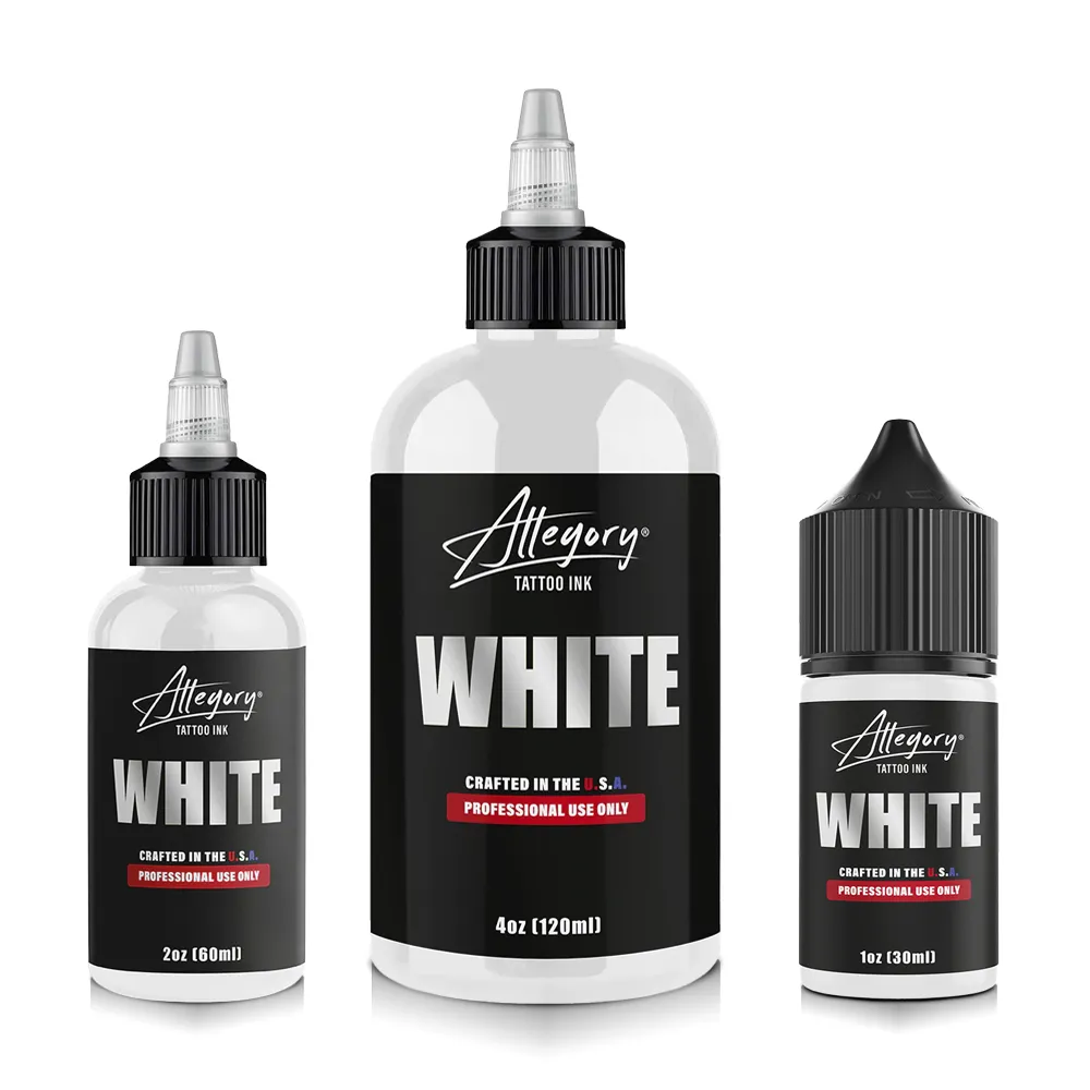 White HighlightsAllegory - White InkWhite ink option for carefully planned bright accents and detail.
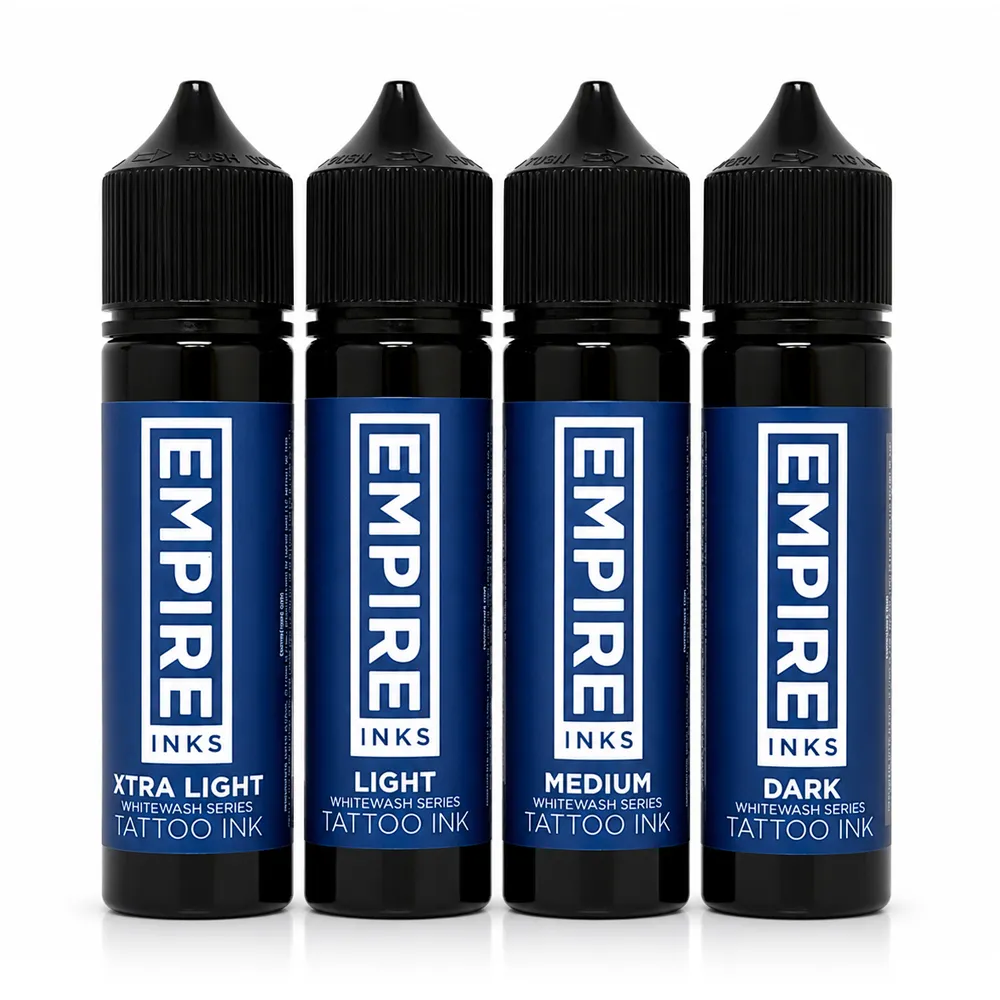 Whitewash PaletteEmpire Inks - Whitewash SetGraded whitewash options to assess for planned lighter passages.
STUDIO BUYING & SESSION CHECKLIST
What should a tattoo artist check before starting a color realism tattoo?
Review the reference, inventory and machine together: assign values, hues, needle groupings and layering choices before the session.
- Reference values: Mark dark anchors, middle tones and highlights before selecting saturated colors.
- Color relationships: Plan warm lights, cool shadows, analogous gradients and intentionally separated complements.
- Skin context: Consider the client's skin tone and color visibility in the palette choice.
- Color inventory: Compare the set against actual required hues, neutrals, flesh tones and whites.
- Grouping assignments: Choose magnums for broad fills, curved mags for transitions and liners for detail.
- Needle specifications: Read pin count, diameter, configuration and taper from the maker's label.
- Layer plan: Identify dark and saturated areas before light accents; avoid needless reworking.
- Custom mixes: Follow manufacturer directions and test the intended tone before use.
- Machine: Treat Peak's short, medium and long strokes as task-based references, not universal presets.
- Healing and care: Discuss possible healed-color softening and AAD-based long-term UV protection.
FAQ
Frequently asked questions about color realism tattoo needles, layering and aging
Answers for tattoo artists moving from simpler color pieces or black-and-grey shading into realistic full-color forms, skin tones and layered pigments.
What is color realism tattooing?
Realistic forms rendered in a full palette with hue, temperature and a clear value structure. StarBrite prioritizes dark-to-light contrast.
How do you do a color realism tattoo step by step?
Map values, assign warm/cool roles, select ink and needles, test mixing and layering, then check the full form.
What tattoo needles do you use for color realism?
Kwadron identifies magnums for fills, curved mags for fades, RS for small shading and RL for contours. Peak discusses bugpins for fine detail.
What tattoo inks and colors do you need for color realism?
StarBrite describes subject hues, skin tones, environmental colors and neutral shadows. Choose from the actual reference.
How do you blend two tattoo colors smoothly?
StarBrite advises overlapping curved-mag passes and analogous transitions. Decide where colors should blend or remain distinct.
How do you avoid muddy colors when tattooing realism?
StarBrite warns that complementary pigments may neutralize through overworking. Protect your layer and contrast plan.
Do you work dark to light in color realism?
StarBrite generally recommends establishing dark and saturated areas before lighter tones. Test on practice skin.
How do you use white tattoo ink for realistic highlights?
Reserve bright points. StarBrite cautions against excess white and applying white over fresh black.
How do color realism tattoos age and heal?
StarBrite says colors may heal softer. AAD advises SPF 30+ because UV can fade some ink.
Does color realism fade faster than black and grey tattooing?
StarBrite says color can heal softer than it looks fresh, and AAD says UV can fade some inks; plan strong value contrast and sun protection for either style.
What stroke and voltage should you use for color blending versus packing?
Peak describes 3.0–3.5 mm blending and 4.0 mm+ heavy packing stroke categories. Follow the device manual.
What are complementary and analogous colors in color realism?
StarBrite says analogous colors support gradients; complements can become muddy if overworked together.
RESEARCH
Sources Consulted
StarBrite provides the attributed color-theory and layering guidance. Kwadron and Peak describe grouping, needle diameter and machine categories. The American Academy of Dermatology supports the statements about UV fading and tattooed-skin care.
- StarBrite: Color Theory for Tattoo Artists
- StarBrite: Tattoo Styles, Inks and Techniques
- StarBrite: Skin-Tone Tattoo Inks for Portrait Work
- StarBrite: Contrast Between White and Black Inks
- Kwadron: Needle Configuration Guide
- Peak: Bugpin vs Standard Tattoo Needles
- Peak: Machine Setup for Lining, Shading and Color
- American Academy of Dermatology: Caring for Tattooed Skin