


 Powered by Comercia.io
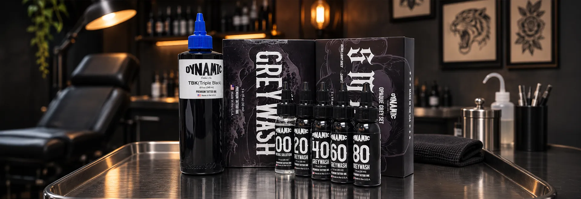
Learn how to build a black and grey tattoo ink palette with Dynamic Triple Black, premixed Dynamic Greywash, and Dynamic Smoke Opaque Greys—and choose between transparent shadows, solid blacks, and intentionally opaque grey tones.
EXPLORE BLACK TATTOO INK COMPARE THE THREE OPTIONS
THE SHORT ANSWER
Quick Answer: How Do You Build a Black and Grey Tattoo Palette?
Start with a professional black such as Dynamic Triple Black for deep contrast and solid areas, add Dynamic Greywash for translucent shading, and use Dynamic Smoke Opaque Greys when the design calls for distinct, more covered grey values. Greywash creates tone by diluting black pigment, while opaque greys are formulated grey colors; artists choose between them based on whether they want a transparent transition or a more defined tonal shape.
A SYSTEM OF VALUES
The Three Roles in a Professional Black and Grey Palette
Black and grey tattooing begins with value structure: the relationship between the darkest marks, intermediate shadows, and lighter areas of the design. An artist can create that structure using black ink alone, a selection of premixed greywashes, opaque greys, or a deliberate combination. The important question is not how many bottles are on the workstation. It is what each bottle contributes to the finished composition.
In this guide, the palette is divided into three functional categories. Dynamic Triple Black is the dark foundation. Dynamic Greywash supplies graded dilutions of black for transparent tonal transitions. Dynamic Smoke Opaque Greys introduces five separate grey colors for sections that need a more distinct, covered appearance. The categories can work together, but they should not be confused with one another.
Strong black
Used for important outlines, bold contrast, deep shadow accents, and dense black areas when appropriate to the technique.
Transparent washes
Used where a design needs soft modelling, gradual shading, realistic depth, or visible transitions into open skin.
Opaque grey
Used for more clearly defined grey shapes, graphic highlights, and tonal blocks with less transparent visual intent.
A common mistake is assuming these products represent interchangeable versions of the same grey. They are different tools for controlling value. You can use fewer bottles for a restrained portrait or a wider range for a stylized composition. What matters is establishing a visual hierarchy before selecting the ink.
Work from a reference that can be read in black and white. Identify the dominant dark areas, the most important midtones, and the spaces you intend to leave untouched. Then select a palette that helps achieve those relationships without unnecessary changes during the tattoo.
SIDE-BY-SIDE PRODUCT COMPARISON
Dynamic Triple Black vs. Greywash vs. Smoke Opaque Greys
These three Dynamic Color products are best compared by formulation role, tonal behavior, and the result the artist wants to build. The table describes practical selection criteria, not a ranking of tattoo quality or healed performance.
| PRODUCT | TYPE | MAIN PURPOSE | TYPICAL WORKFLOW | WHAT IT IS NOT |
|---|---|---|---|---|
| Dynamic Triple Black | High-pigment black ink | Strong black contrast, packing, deeper shading | Dark anchors, solid fills, selected linework | Not a premixed range of light-to-dark greys |
| Dynamic Greywash Set | Premixed black dilutions | Transparent tonal transitions | Soft shadows, portraits, gradients, atmosphere | Not five opaque grey pigments; #00 is mixing solution |
| Dynamic Smoke Opaque Greys Set | Five formulated opaque grey colors | Distinct grey values and coverage | Defined midtones, graphic shading, grey fills | Not a transparent black-dilution scale |
The visible effect depends on skin, application, value planning, and healing. Product type describes intent, not a guaranteed result.
Greywash reduces the concentration of black pigment in a working mixture, so the skin contributes more visibly to the light tonal impression. Opaque grey supplies a formulated grey color intended to read with more coverage and a more defined value. Neither automatically replaces the other in a detailed black-and-grey tattoo.
PRODUCT 01 / THE BLACK FOUNDATION
Dynamic Triple Black: The Deepest Anchor in the Palette
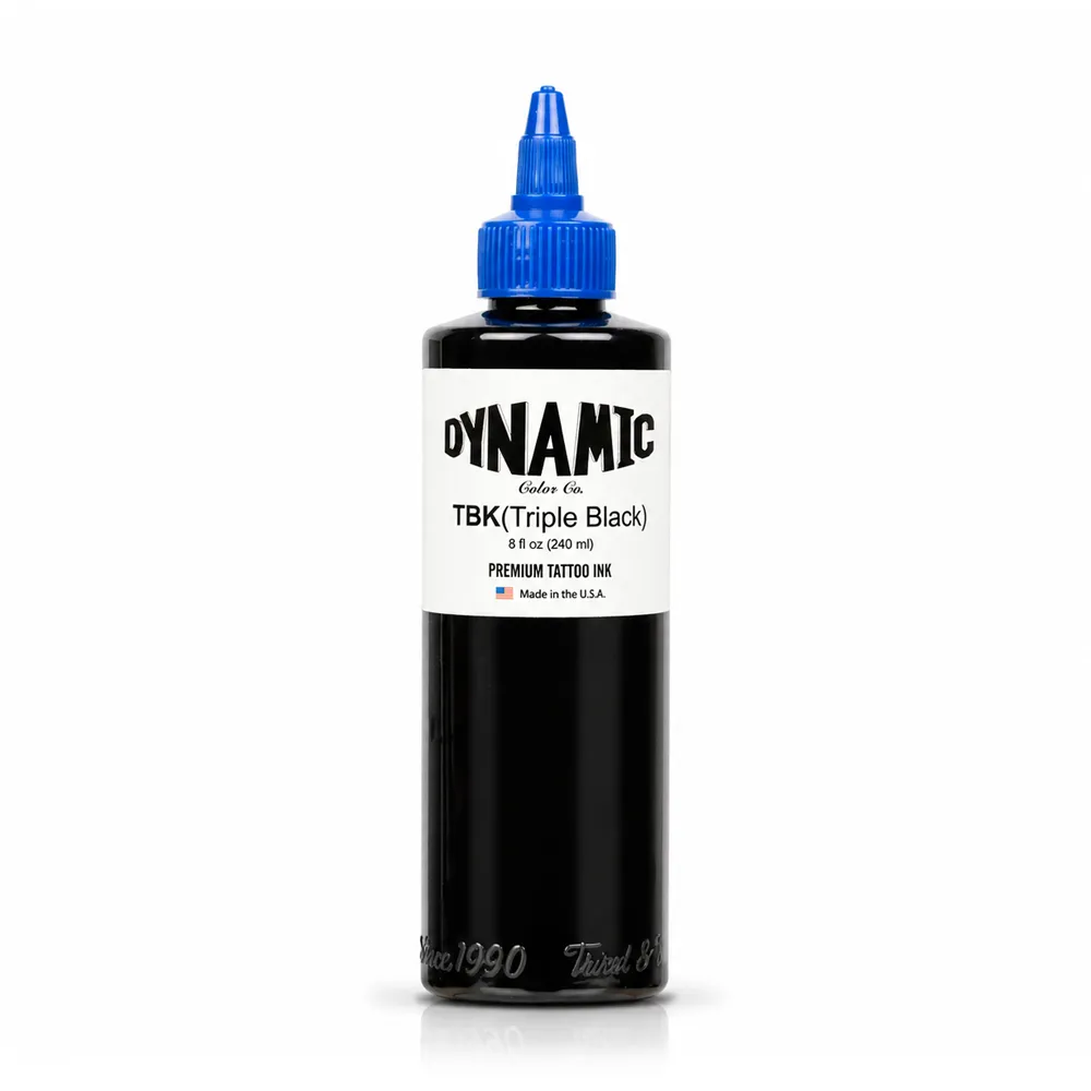
Dynamic Triple Black is Dynamic Color's high-pigment black formulation, made in the United States. The manufacturer describes it as slightly thicker than its original black, while still relatively thin compared with some other tattoo ink formats. Its primary published applications include shading, packing, and creating greywash mixtures.
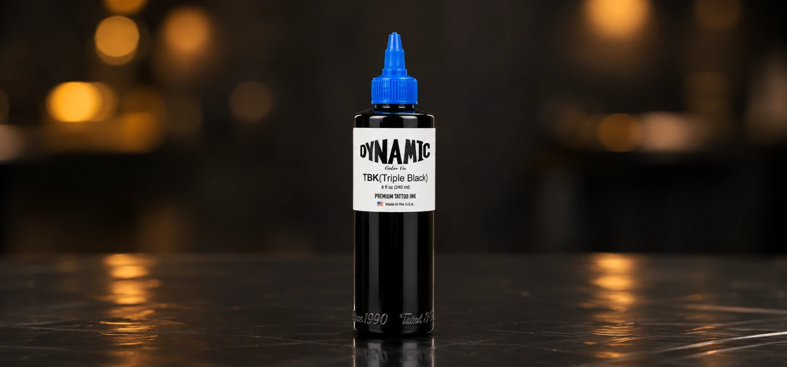
For a black-and-grey artist, Triple Black can serve as the visual anchor that makes surrounding values easier to read. Dense blacks provide separation between foreground and background, help define deep recesses, and prevent an entire piece from looking equally soft. Depending on technique and artist preference, the same black may also be used in selected linework.
Think of solid black as a limited but intentional component of the design. A portrait might need only small dark accents around the eyes, hair, or deepest shadows. A graphic black-and-grey piece might rely on larger dark shapes to hold its silhouette. The correct amount of black is a composition decision, not a fixed percentage of tattooed area.
Dynamic also notes that Triple Black wipes clean easily from the skin, for a faster work rate and a cleaner canvas. As with any black, judge saturation and skin response as the work progresses.
Choose it when the piece needs deliberate dark anchors, bold value separation, or significant black packing. If the primary goal is a feathered light shadow, a premixed greywash may be a more appropriate starting point than repeatedly working concentrated black into the same area.
When building a cohesive palette, reserve a clear role for the concentrated black and avoid turning every dark grey into solid black. The contrast between a deep black and a carefully selected dark wash can create dimension without requiring every shadow to reach the maximum value.
VIEW DYNAMIC TRIPLE BLACK AT SVT SHOPPRODUCT 02 / TRANSPARENT VALUE CONTROL
Dynamic Greywash Set: Four Shades and #00 Mixing Solution
Dynamic Greywash is a premixed black-dilution system developed from Dynamic Color's original black formula. The manufacturer describes the series as the result of extensive testing and feedback from artists working in black and grey. It is designed to provide a repeatable range of tonal strengths without asking the artist to build every dilution from scratch during every appointment.
The numbered ink shades are #20, #40, #60, and #80. They move from lighter to progressively deeper wash values. The #00 product is Dynamic's mixing solution, rather than a fifth grey pigment. This distinction matters because the clear mixing medium serves a different role from a bottle of colored wash.
Dynamic describes its #00 mixing solution as being made with filtered, distilled, UV-treated water and witch hazel. The point of a dedicated mixing medium is to provide a documented product for the manufacturer's intended ink-mixing workflow; it is not an invitation to add ordinary tap water, an unknown liquid, or an improvised ingredient.
| LABEL | WHAT IT IS | HOW ARTISTS MAY USE IT |
|---|---|---|
| #00 | Mixing solution; not a colored greywash | Manufacturer-designated medium for adjusting a compatible mixture |
| #20 | Lighter premixed greywash | Subtle shadows, atmospheric transitions, lighter modelling |
| #40 | Light-to-middle greywash value | Building volume and connecting light and medium shadows |
| #60 | Deeper medium greywash | Stronger shadow structure and mid-to-dark transitions |
| #80 | Darkest numbered greywash in the series | Deep transparent shadow before selected solid-black accents |
These numbers identify products in the manufacturer's tonal sequence. They are not promises that an area of healed skin will display a precise percentage of black. A wash's apparent value is affected by the amount deposited, technique, the surface beneath it, and the way the tattoo settles.
Dynamic offers the greywash range in 1 oz and 4 oz bottle-set formats. The manufacturer's current 4 oz set explicitly includes the #00 mixing solution. Before ordering, confirm the exact contents of the particular set or bottle format you intend to use rather than assuming all packaging configurations include identical extras.
For a realism workflow, an artist might use a lighter wash for background haze, a middle wash for rounded forms, and a darker wash to define a recess. What matters is keeping those values organized. A premixed set supports consistency, but it does not determine which cup or shade must be used for every feature.
VIEW DYNAMIC GREYWASH SET AT SVT SHOPPRODUCT 03 / FORMULATED GREY VALUES
Dynamic Smoke Opaque Greys: Five Steps From Light to Dark
Dynamic Smoke Opaque Greys Set takes a different approach from a black dilution. The manufacturer offers five prepared grey colors, positioned as opaque values for artists who want more defined grey shapes and controlled midtone coverage. The range is professionally formulated, pre-dispersed, vegan, and made in the United States, according to Dynamic.
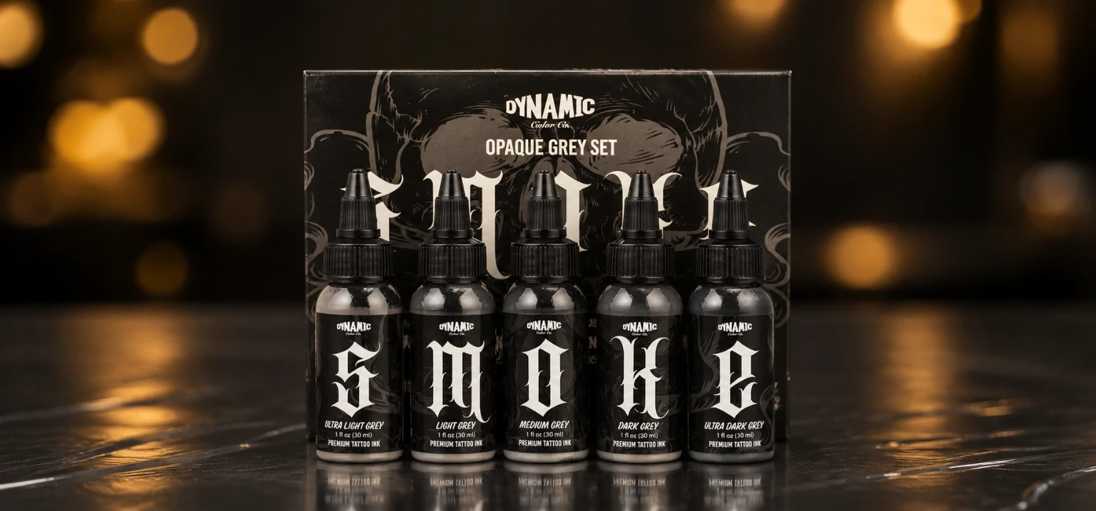
Its five labels spell SMOKE: S, M, O, K, and E. Each letter corresponds to a named shade in a light-to-dark progression, making it easier to separate bottles and plan a piece according to actual value rather than guessing from an unmarked cup.
Brightest formulated grey in the set; useful to consider for visible light-grey shapes and accents.
A step below the lightest tone for soft-looking but more defined grey areas.
A central value for larger midtone shapes, graphic modelling, and transitions between the set's ends.
A deeper opaque value that can create tonal separation without becoming solid black.
The darkest formulated grey in the series; a bridge between dark-grey shapes and a separate black anchor.
An opaque grey is not the same visual tool as a transparent wash at a similar perceived darkness. Its purpose is to create a more distinctly grey area, especially where the design uses deliberate tonal blocks, soft-edged graphic shapes, or grey accents that should not simply read as a thin black shadow.
For example, an illustrative piece may use Smoke O for a medium-grey object, Smoke K for a darker plane, and Triple Black for a nearby silhouette. A realism artist may reserve an opaque grey for certain reflected-light effects or to clarify a feature among transparent shadows. These are possible approaches, not mandatory applications or manufacturer-verified healed results.
Smoke is offered in 1 oz and 4 oz formats through the manufacturer. The linked SVT Shop set gives artists access to the five-shade system. Check the bottle size and exact set contents when selecting stock for the studio, particularly if you use one midtone more often than the others.
VIEW DYNAMIC SMOKE OPAQUE GREYS AT SVT SHOPUNDERSTAND THE VISUAL EFFECT
Greywash vs. Opaque Grey: Transparency Is the Main Difference
A transparent greywash and an opaque grey may appear similar while pooled in ink cups, yet they are intended to approach the design differently. Greywash builds a grey impression with a lighter concentration of black pigment. Opaque grey is supplied as an actual formulated grey color, intended to offer more body and coverage rather than depending primarily on the appearance of black diluted against skin.
With greywash, the artist often relies on preserving open skin and controlling the transition from light to dark. This approach can be well suited to portrait modelling, subtle background haze, smoke effects, and smooth tonal gradients. The resulting visual lightness is strongly related to the relationship between deposited black pigment and the skin beneath it.
With opaque grey, the artist can plan more distinct light, medium, and dark grey shapes. That may suit graphic realism, illustrative work, stylized objects, defined highlights, and compositions requiring visibly separated planes. It can also change how an artist approaches blending: two already-formulated grey colors are not necessarily handled in the same way as two transparent black dilutions.
Neither option is automatically more realistic or technically superior. A highly convincing portrait can be created with carefully managed greywash and solid black, while a more illustrative black-and-grey piece may benefit from grey pigment placed in intentional shapes. The drawing and value plan should decide which effect belongs where.
You want tonal transparency
The goal is a graduated shadow, a softened edge, atmospheric depth, or light-to-dark modelling with the skin remaining visually important.
You want a defined grey color
The goal is an identifiable grey plane, filled midtone, controlled graphic contrast, or a light-grey element distinct from a transparent shadow.
COMPOSITION BEFORE INK
Plan Contrast, Negative Space, and the Full Value Range
Before choosing an ink cup, simplify the artwork into a small number of readable value groups. Ask where the darkest black must appear, which areas belong in the middle range, and where untouched skin can provide light. If the design reads clearly before tattooing, the choice between greywash and opaque grey becomes much easier to make.
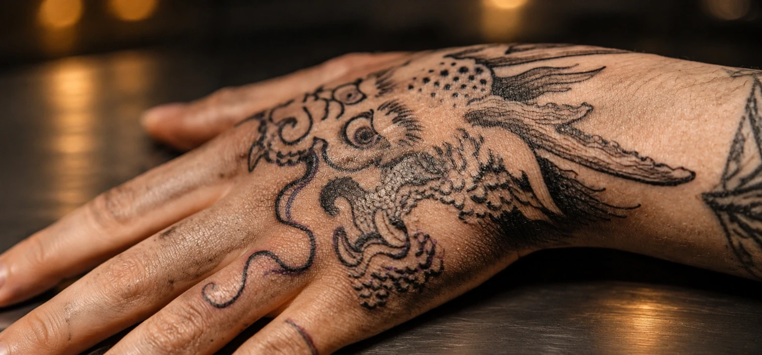
Black and grey designs are often weakened by excessive middle values. When nearly every area has similar density, the eye has difficulty finding a focal point. Strong contrast does not require filling everything with black; it requires deliberately separating the areas that are meant to draw attention from those that support them.
Negative space is part of the palette. Skin left open can represent a highlight without placing another pigment there. That is different from using Smoke S Ultra Light Grey to create a visibly grey shape in a light area. Neither is inherently preferable: the decision depends on the image, skin tone, placement, and desired contrast.
Large compositions benefit from stepping back and checking value relationships at a distance. A darker background may make a foreground figure look lighter, while a deep black accent may make nearby greywash appear softer. Artists should judge the whole image instead of treating every little shaded area as an independent problem.
As an exercise, reduce the design to dark, middle, and light groups before choosing individual greywash or Smoke shades. If those three groups still form a readable image, additional tones can support the composition instead of making it unnecessarily complex.
THREE PRACTICAL ARRANGEMENTS
How to Build Your Working Black and Grey Palette
A complete shelf is not the same as a practical workstation. Choose the bottles for the session according to the design. The following three arrangements show how an artist might organize Triple Black, Dynamic Greywash, and Smoke for distinct visual goals.
Triple Black + premixed Greywash
Use concentrated black as the darkest anchor and select from the four numbered washes for tonal modelling. This keeps the palette focused on black-pigment values and leaves room for skin to serve as the lightest part of the image. It is a logical arrangement when soft gradients are more important than opaque grey fills.
Pay attention to the separation between #60 and #80 and the strongest black accents. They should not all become visually identical. Record which shade is used in each area so adjustments remain intentional across a large design.
Triple Black + Smoke Opaque Greys
Choose solid black for strong silhouettes and Smoke's five values for distinct grey shapes, stylized planes, and visible accents. This approach can work for illustrative subjects where the artist wants the middle values to behave more like deliberately selected colors.
Rather than automatically opening all five greys, select the few that give the drawing enough separation. Too many similar grey planes can reduce the impact of a simple, bold design.
Triple Black + Greywash + selected Smoke shades
Use Greywash for the softer underlying transitions, reserve opaque Smoke values for specific midtone shapes or reflected-light details, and finish the value plan with targeted black. A hybrid palette can provide both transparency and definition in a single composition.
The trade-off is more complexity. An artist should decide which elements need opaque grey before the session rather than adding it everywhere because the bottles are available.
CHOOSE BY ARTISTIC INTENT
When Artists Use Greywash, Opaque Greys, and Solid Black
Tattoo style offers a useful starting point, but no style requires every artist to use the same ink system. A working method is shaped by the reference, chosen cartridges, desired edges, the client's skin, and the individual artist's technique. The examples below are workflow considerations rather than claims about a guaranteed outcome.
Portraits and organic forms
Premixed greywash is a natural choice for gentle changes in value across skin, fabric, hair, and softly lit objects. Triple Black can define the darkest features. Selected opaque greys may be useful when a distinct grey shape belongs in the reference, but they need not be central to every portrait.
Clearly separated shapes
Smoke offers named grey values for planned planes and tonal blocks. Triple Black can establish the outermost contrast; greywash may soften backgrounds or transitions between the more graphic elements.
Solid areas with controlled relief
Triple Black is the key product to evaluate when dark masses carry the composition. Greywash may create depth around the black areas, while opaque grey can distinguish selected elements without reducing every dark form to a soft wash.
Soft edges and tonal movement
The transparency of greywash lends itself to atmospheric transitions. If a cloud, object, or graphic accent needs a clearer grey tone, a Smoke shade may provide a different visual approach. Avoid making the entire background equally dense.
For large projects, use a consistent naming scheme in the reference image and station notes. Label the planned darkest areas, mid-grey shapes, and soft transition zones. This reduces confusion when the project moves across multiple sessions and makes it easier to communicate the intended visual result.
CONSISTENCY AND PERSONAL STYLE
Premixed Greywash vs. Building Your Own Washes
Some experienced tattoo artists develop their own preferred greywash strengths. That can suit an established working method, but it introduces another variable: accurate dilution must be repeated if the same tonal sequence is needed again. Premixed greywash reduces that preparation step by providing designated shades in labeled bottles.
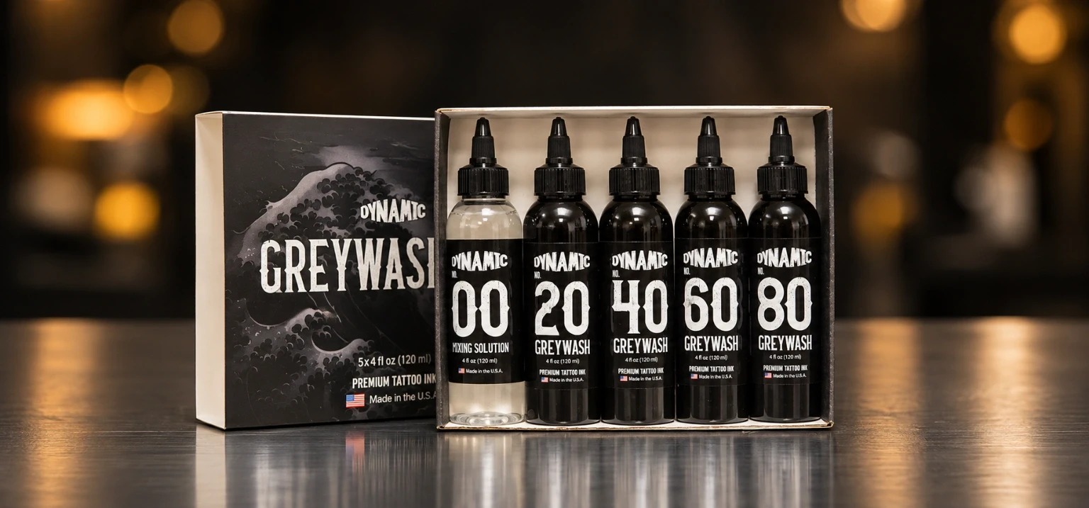
Dynamic's greywash range uses the manufacturer's original black base and a documented #00 mixing solution. It is not simply a recommendation to add water to any bottle until the mixture looks right. If you choose to customize a compatible wash, use only the manufacturer's designated medium and current instructions, and follow the studio's handling procedures.
Premixed is especially useful when you want a familiar sequence from appointment to appointment, have more than one artist coordinating a larger project, or need to track which tonal family was used. It is also convenient for apprentices learning the visual difference between clearly identified shades under supervision.
Custom mixing allows personal control but does not automatically produce a more sophisticated image. The artist should decide whether that additional flexibility improves the actual work. The target is a consistent value relationship, not a complicated mixture made for its own sake.
Smoke opaque greys are a different category altogether. Adding more mixing medium to a concentrated black is not equivalent to selecting a formulated opaque grey. If the design needs a filled grey plane with the visual character of an opaque pigment, a dedicated grey color is the more relevant comparison.
INK MEETS TECHNIQUE
Cartridge Choice, Shading Feel, and Tonal Consistency
Ink is only one part of a black-and-grey workflow. The working effect also depends on cartridge grouping, machine response, the motion of the artist's hand, and the shape being tattooed. A smooth-looking shadow is not produced merely by selecting a light bottle; it requires control of the entire application.
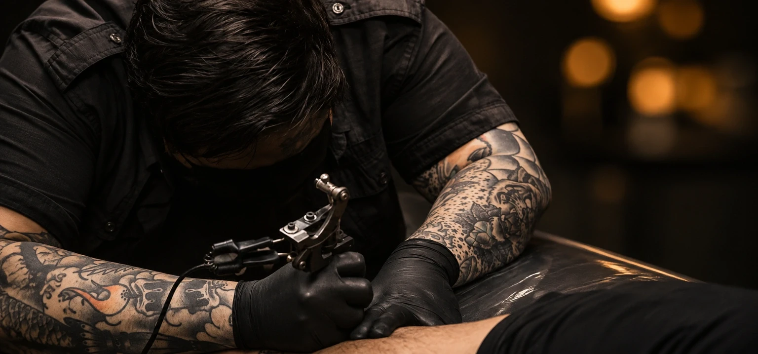
RL (round liner) groupings are commonly used for linework and defined details. RS (round shader) groupings can be considered for compact shading. CM/SEM (curved magnum) configurations are relevant to broad transitions and soft-edge shading, while M1/MG (straight magnum) groupings can be useful where a flatter working edge suits the fill. These names describe needle arrangements, not mandatory pairings with particular bottles.
A broad magnum may handle a large background differently from a small liner used for precise texture. An artist might use the same premixed wash with different cartridges in separate areas and see different working characteristics. This is why the shade code should not be treated as a fixed final darkness independent of technique.
When testing a palette on synthetic skin, keep the machine and cartridge choice stable for a set of comparable samples. Record which wash, which opaque grey, and which concentrated black were used. Then evaluate the visual separation between them. Synthetic surfaces do not predict human skin healing, but they can help with organization and familiarity.
Do not switch ink, grouping, machine response, and hand technique simultaneously when you are trying to understand a tonal difference. Keep the comparison controlled and use a mentor's feedback when evaluating technical adjustments.
FROM REFERENCE TO WORKSTATION
A Practical Studio Workflow for Black and Grey Tattoo Ink
The goal of a working palette is to make decisions easier during the session. A studio does not need every available shade poured into a cup when only three or four values are important to the reference. Keep the setup focused and consistent with the artist's usual professional procedure.
-
Define the darkest value.
Mark the design areas where concentrated black provides essential contrast. Consider Triple Black for that role if its handling characteristics suit your technique.
-
Identify transparent transitions.
Select the greywash strengths needed for softer midtones and light-to-dark changes. Plan those values rather than deciding based only on what a cup looks like when filled.
-
Decide whether any grey must be opaque.
Review shapes, grey fills, and highlights. If the design calls for a visibly formulated grey, identify the appropriate Smoke shade rather than expecting a diluted black to behave identically.
-
Organize and label your cups.
Keep separate, appropriately prepared cups for the selected products. Match the arrangement to your value chart so darker and lighter greys are not confused during the session.
-
Evaluate the whole composition.
Assess how the dark anchors, middle values, and open skin read together. Do not keep adding ink simply because a temporary work-in-progress appearance seems lighter than expected.
-
Document the session.
Record product names, shades, and any approved custom mixtures for future reference. Compare healed photographs where appropriate rather than judging long-term results from fresh work alone.
This is a planning framework, not a procedural substitute for professional tattoo training. Needle control, actual work on skin, and treatment of the working area should follow the artist's established training and studio practices.
BUY FOR YOUR REAL PORTFOLIO
How Artists Decide What Grey Ink to Use
Start with your recent work rather than buying a new product just because it has five shades. Review what proportion of your tattooing consists of deep black fills, soft photographic modelling, clearly defined grey objects, or a combination of those approaches. A bottle is worth adding when it serves a job you encounter regularly.
An artist specializing in transparent black-and-grey realism may prioritize a reliable black and a repeatable greywash range. An illustrator who wants controlled, clearly filled midtones may prioritize a black and the Smoke set. A studio offering both techniques can use the three product groups as a larger palette, with only the necessary bottles prepared for each appointment.
Do not equate more shades with better control. A restrained five-value design can have stronger depth than a piece using every available grey. More options mean more decisions, more cup organization, and more chances to create middle values that are too similar to one another.
If you are beginning black-and-grey tattoo training, work under an experienced artist and study value drawings before trying to reproduce a complex portrait on skin. Practice identifying dark, middle, and light areas on paper, then learn how your approved materials behave through supervised exercises.
Finally, consider replenishment. If your most frequently used bottle is a medium wash or a specific Smoke shade, plan stock around usage rather than purchasing equal quantities indefinitely. Confirm formats and product details before ordering, and keep your current formulation records organized.
KEEP THE VALUES CLEAR
Common Black and Grey Tattoo Ink Mistakes
- Assuming every grey is a diluted black. Smoke's opaque colors serve a different visual purpose from premixed greywash.
- Counting #00 as a grey pigment. It is a designated mixing solution, not another numbered grey tone.
- Using Triple Black for every tonal job. Concentrated black may overwhelm areas designed as soft transparent shadows.
- Using opaque grey where the reference needs openness. A filled grey color may alter the delicate appearance of an intended transparent transition.
- Opening every shade without a value plan. Extra choices can complicate the station and weaken contrast.
- Confusing shade labels with guaranteed healed percentages. The numbered sequence does not promise exact darkness in skin.
- Improvising a dilution medium. Use the correct manufacturer-designated mixing product and instructions, not ordinary tap water.
- Ignoring negative space. Some light areas are more effective when intentionally left open.
- Forgetting cartridge differences. The same shade can behave differently with different groupings and working techniques.
- Judging only fresh tattoos. Document healed work when evaluating how a palette fits your artistic approach.
- Mixing up ink cups or labels. A clear station plan reduces errors during long shading sessions.
- Assuming any one ink guarantees permanent darkness. No product eliminates the effects of application, healing, skin, and time.
BRIEF PROFESSIONAL HANDLING NOTE
Authenticity, Mixing, and Ink Handling
Dynamic Color states that its inks use identifiable product packaging, including anti-counterfeiting features and sealed bottles. Confirm the product identity, batch information, expiration date, and packaging condition before use, and follow the manufacturer's current instructions for handling and storage.
Keep ink portions in appropriate single-use cups, avoid returning unused ink to its original container, and never introduce an unapproved liquid when preparing a wash. The FDA has documented microbial contamination in tattoo inks and has issued manufacturing guidance on reducing that risk. These considerations matter whether you use concentrated black, a premixed dilution, or an opaque grey.
Follow applicable studio hygiene procedures, and consult appropriate professional or medical guidance when concerns arise.
BEFORE YOU ORDER
Black and Grey Tattoo Ink Buying Checklist
- I know which parts of my design need concentrated black.
- I understand the difference between transparent and opaque grey.
- I selected greywash strengths that fit my shading workflow.
- I know #00 is a mixing solution, not a grey pigment.
- I can identify Smoke S, M, O, K, and E from light to dark.
- I chose bottle sizes based on actual studio usage.
- I have a clear plan for organizing and identifying ink cups.
- I will use only manufacturer-approved mixing media and directions.
- I will check packaging, lot information, and expiration details.
- I will evaluate healed examples instead of trusting guarantees.
- I am adding shades because the design needs them, not because more is automatically better.
For most artists, the most useful palette is the smallest one that covers the intended range of contrast and effects. Expand it when a specific technique calls for another value, rather than trying to make a complex shade collection substitute for tonal control.
BUILD YOUR PROFESSIONAL PALETTE
Shop Dynamic Black and Grey Tattoo Inks at SVT Shop
SVT Shop helps tattoo artists, apprentices, and studios choose supplies that fit their working style. Based in El Paso, Texas, SVT Shop offers Next Day Delivery in El Paso; confirm eligible delivery options when ordering.
Start with the visual result you want: a concentrated black for definition, premixed greywash for soft transitions, or opaque greys for visibly filled tonal shapes. These three Dynamic Color products cover different roles and can be selected separately or combined in a more extensive studio palette.
 01 / DEEP BLACK
Dynamic Triple Black
A high-pigment black to consider for bold anchors, dark shading, and solid packing.
VIEW TRIPLE BLACK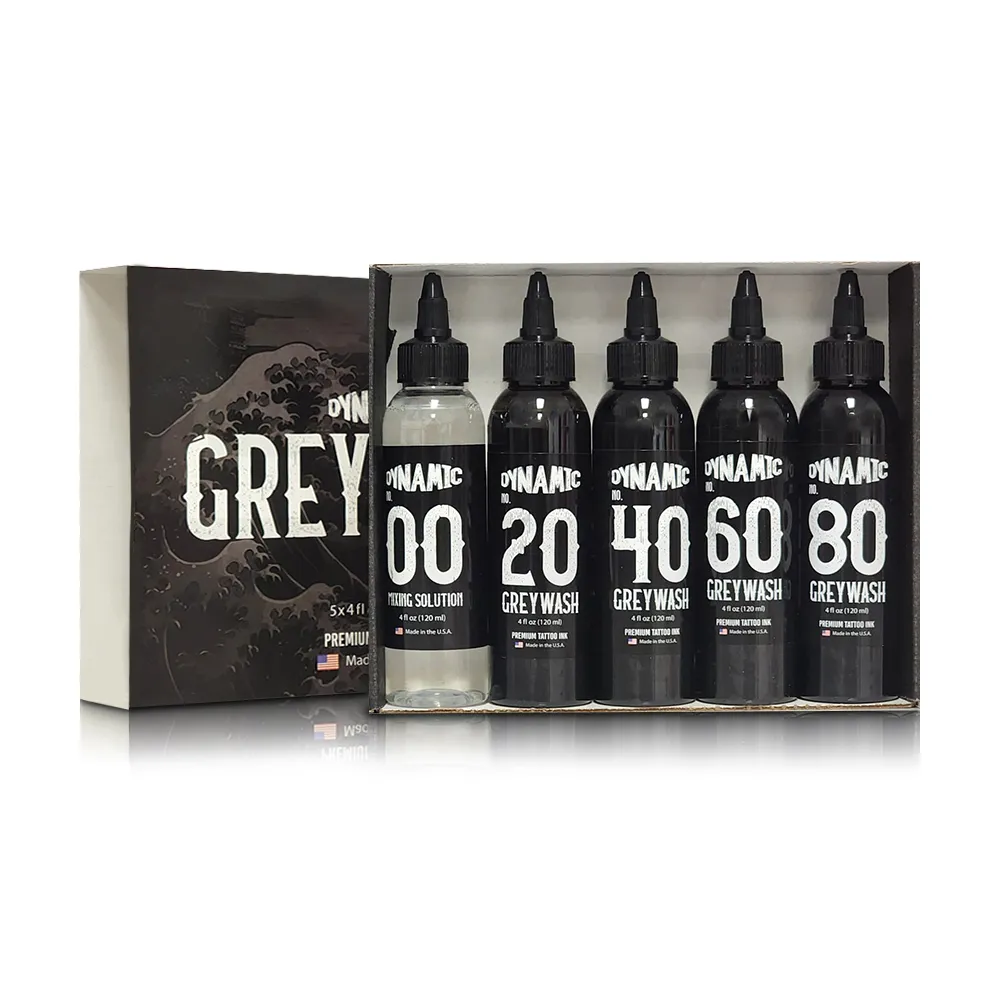 02 / TRANSPARENT SHADING
Dynamic Greywash Set
Four numbered black dilutions for tonal gradation, with the manufacturer's #00 mixing solution system.
VIEW GREYWASH SET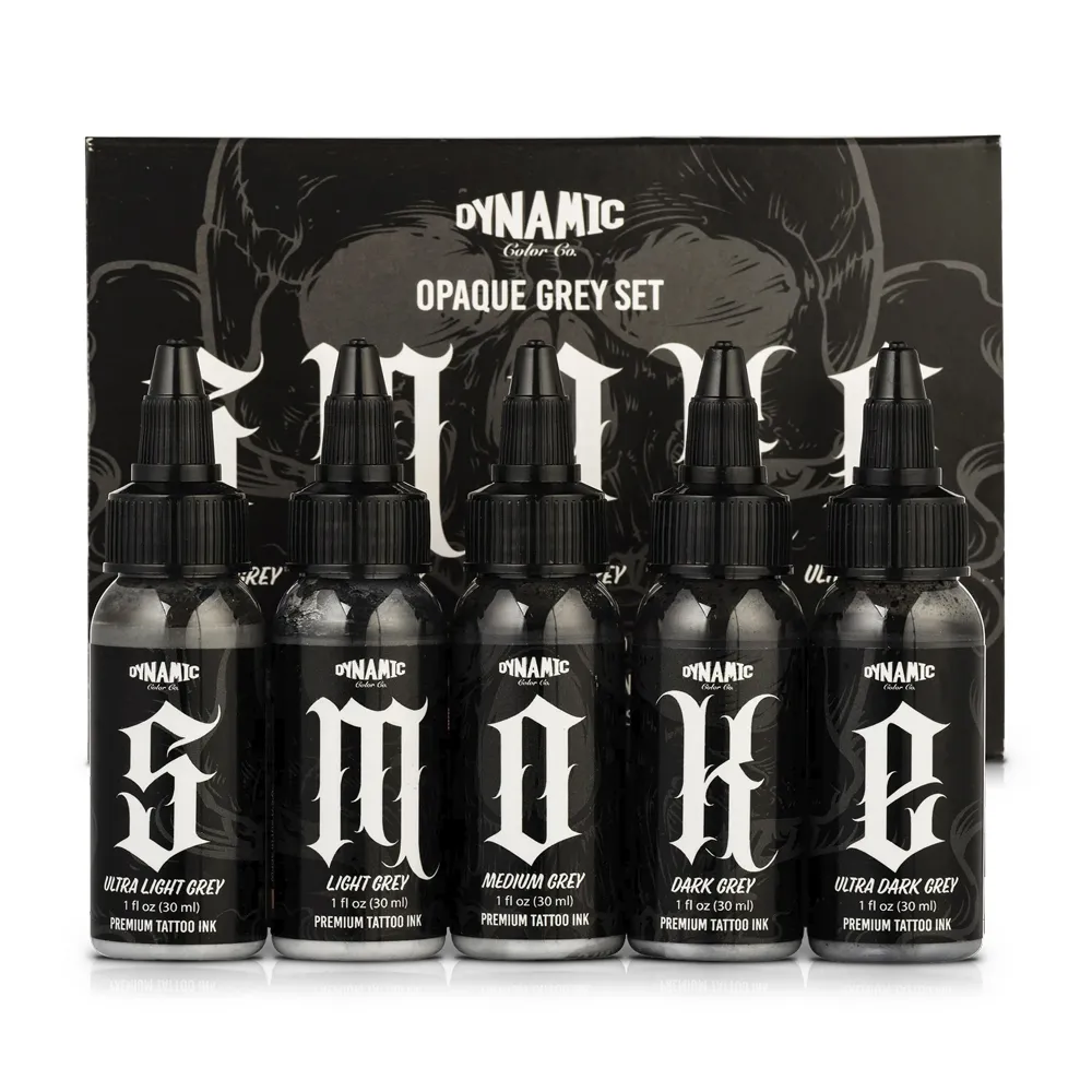 03 / OPAQUE TONAL VALUES
Dynamic Smoke Opaque Greys
Five formulated grey shades spanning Ultra Light to Ultra Dark for defined values.
VIEW SMOKE SETCompare more professional black ink options in Black Tattoo Ink at SVT Shop.
ARTIST AND BUYER QUESTIONS
Frequently Asked Questions
What is the difference between greywash and opaque grey tattoo ink?
Greywash uses diluted black pigment to create lighter, generally more transparent tonal values. Opaque grey is a formulated grey ink intended to provide a more defined colored grey area. Greywash is commonly selected for soft gradients; opaque grey is useful when the artist wants a distinct midtone or grey fill. Neither is universally better.
What is Dynamic Triple Black best used for?
Dynamic identifies Triple Black as a high-pigment formula particularly suited to shading, packing, and greywash preparation. Artists may also choose it for selected linework according to their technique. Its primary role in the palette discussed here is creating deep contrast and controlled solid blacks.
How many shades are in Dynamic Greywash Set?
Dynamic's premixed greywash system has four colored shades: #20, #40, #60, and #80. Dynamic #00 is a mixing solution, not a fifth grey pigment. The manufacturer's 4 oz bottle-set offering explicitly includes mixing solution; confirm the contents of your exact package.
Does #20 mean a guaranteed 20% grey tattoo after healing?
No. The shade number identifies a formulation in the Dynamic greywash range. It does not guarantee that tattooed skin will show an exact visual percentage after healing. The outcome depends on technique, pigment placement, skin characteristics, and the overall design.
What does SMOKE stand for in Dynamic's opaque grey set?
The five codes are S for Ultra Light Grey, M for Light Grey, O for Medium Grey, K for Dark Grey, and E for Ultra Dark Grey. They form a named, light-to-dark opaque-grey sequence rather than a series of transparent black dilutions.
Should I use greywash or Smoke for black-and-grey realism?
Greywash is a strong option to compare for gradual shading and photographic modelling. Smoke may be useful when the artwork requires a defined grey color, a distinct shape, or a particular stylized accent. Many artists can work effectively with one system; a hybrid approach is an artistic choice, not a requirement.
Can Triple Black, Dynamic Greywash, and Smoke be used in one tattoo?
They can be considered as complementary parts of a professionally planned palette, provided the artist follows relevant product instructions and studio procedures. Use black for the darkest structure, washes for transparent transitions, and opaque greys only where their different visual behavior supports the composition.
Can I make an opaque grey by simply diluting black ink?
Diluting black creates a greywash-style mixture rather than automatically producing a formulated opaque grey. Dynamic's own black-ink guidance distinguishes its #00 medium for washes from its white mixing medium for opaque-grey mixing. Use a manufactured opaque shade when that is the visual effect you need.
Why do artists choose premixed greywash instead of making every dilution?
A labeled premixed range reduces preparation variables and gives the artist a familiar sequence of shades. Custom mixing can suit an established personal technique, but it requires consistent preparation and the correct designated mixing medium. Neither method replaces effective value planning.
Do I need all five Smoke shades for one tattoo?
No. The complete set provides options, but a well-planned design may require only a light, medium, and dark opaque grey—or none. Choose the values needed to preserve the composition rather than using every bottle simply because it is available.
Are Dynamic Smoke Opaque Greys vegan and made in the United States?
Yes. Dynamic Color lists the Smoke range as vegan, never tested on animals, pre-dispersed, and made in the USA.
Will Triple Black or Smoke grey stay exactly the same forever?
No ink should be presented as having a guaranteed, unchanging appearance. Initial application, skin, healing, environment, and time can affect how a tattoo is perceived. Review appropriate healed examples and avoid relying on permanent darkness or color-stability promises.
MANUFACTURER AND OFFICIAL REFERENCES
Sources Consulted
Product details and shade names come from Dynamic Color's official product pages; the FDA reference covers its guidance on preventing tattoo ink contamination.
- Dynamic Color — Triple BlackManufacturer product description, ink consistency, and listed applications.
- Dynamic Color — Dynamic Blacks ExplainedTechnical distinctions between concentrated black, greywash mixing medium, and opaque-grey mixing.
- Dynamic Color — Greywash 4 oz Bottle SetCurrent manufacturer set format and #00 mixing-solution inclusion.
- Dynamic Color — Greywash 1 oz Bottle SetManufacturer's smaller premixed set format.
- Dynamic Color — #00 Mixing SolutionManufacturer information about the designated dilution medium, water preparation, and witch hazel.
- Dynamic Color — Smoke Opaque Greys SetOfficial five-shade opaque-grey product range, formats, and brand specifications.
- Dynamic Color — Smoke Opaque Grey CollectionConfirmed S, M, O, K, and E shade names and light-to-dark order.
- U.S. FDA — Final Guidance on Tattoo Ink ContaminationOfficial context for responsible ink manufacturing and contamination prevention.
Editorial note: Last updated November 12, 2026. Product descriptions, ingredients, and shade naming reflect the manufacturer's published information. Studio applications depend on the artist's technique, client's skin, and the design; no healing, saturation, or longevity outcome is guaranteed. Follow current manufacturer directions, professional studio procedures, and applicable regulations.